Feature Item E

Component that represents a feature or functionality.
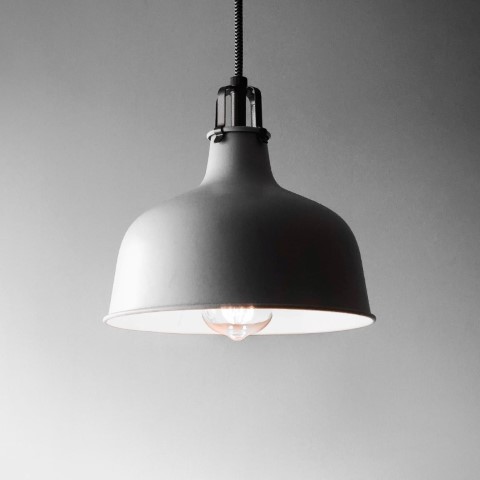
Preview

01

Cool Feature

This is made out of metal or a super strong structure

Cool Feature
Feature

Premium Design

This is made out of metal or a super strong structure

Premium Design

Code

import React from "react"; import styles from "./feature-item-e.module.css"; type Props = { className?: string; children?: React.ReactNode; title: React.ReactNode; subTitle?: React.ReactNode; description?: React.ReactNode; aspect?: "default" | "square" | "portrait" | "landscape"; imageSrc?: string; icon?: React.ReactNode; secondaryIcon?: React.ReactNode; href?: string; align?: "top" | "center" | "bottom"; rounded?: "none" | "small" | "medium" | "large"; shadow?: "none" | "medium"; // Put additional variants here, then define them in the CSS variant?: "default" | "blue" | "white" | "yellow-dark"; }; export default function FeatureItemE({ className, children, title, subTitle, description, aspect, imageSrc, icon, secondaryIcon, href, align = "top", rounded = "medium", shadow = "none", variant = "default", }: Props) { const content = ( <div className={[ styles["wrapper"], styles[`align-${align}`], styles[`r-${rounded}`], styles[`ar-${aspect}`], styles[`sh-${shadow}`], styles[`variant-${variant}`], className, ].join(" ")} > <div className={styles["content-wrapper"]}> {icon && <div className={styles["icon"]}>{icon}</div>} {secondaryIcon && ( <div className={styles["icon-secondary"]}>{secondaryIcon}</div> )} {subTitle && <h6 className={styles["sub-title"]}>{subTitle}</h6>} {title && <h4 className={styles["title"]}>{title}</h4>} {description && <p className={styles["desc"]}>{description}</p>} {children && <div className={styles["desc"]}>{children}</div>} </div> {imageSrc && ( <div className={styles["image-wrapper"]}> {/* If you use Next.js, replace 'img' with 'Image' element */} <img className={[styles["image"]].join(" ")} src={imageSrc} alt={title?.toString()} width={360} height={360} /> </div> )} </div> ); if (href) { // Replace the "a" element with "Link" if you use Next.js, react-router ... return ( <a href={href} className={styles["link"]}> {content} </a> ); } else { return <>{content}</>; } }

Design

Figma design file:

Documentation

Properties

Props of the component:

  • className (string): Specifies the CSS class of the component.
  • children (ReactNode): React children of the component. Specifies the ReactNode placed inside the component.
  • title (string or ReactNode): Specifies the text or component that will be used as the title.
  • subTitle (string or ReactNode): Specifies the text or component that will be used as the subtitle.
  • description (string or ReactNode): Specifies the text or component that will be used as the description.
  • aspect ("default" | "square" | "portrait"): Specifies the aspect ratio of the frame.
  • imageSrc (string): Specifies the URL of the image.
  • icon (ReactNode): Specifies the main icon component.
  • secondaryIcon (ReactNode): Specifies the secondary icon component.
  • href (string): Specifies the URL if the component is a link.
  • align ("top" | "center" | "bottom"): Specifies the vertical alignment of the content.
  • rounded ("none" | "small" | "medium" | "large"): Specifies the border radius of the frame.
  • shadow ("none" | "medium"): Specifies the size of the shadow of the frame.
  • variant ("default" | "red" | "simple" | "blue" | "blue-white" | "blue-simple" or a customized value): Specifies the color or theme variant of the component. Check out the "Sample CSS customization" below for an example of how to use it.
Sample CSS customization
.variant-blue { --bg-color: #632aff; --fg-color: rgba(255, 255, 255, 0.6); padding: 2rem; } .variant-blue .title { color: rgba(255, 255, 255, 1); }