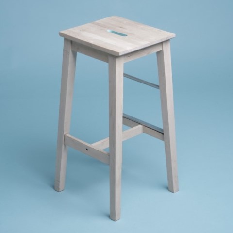
Product Item B

Component that represents a product item.

Preview

Code

import styles from "./product-item-b.module.css"; type Props = { className?: string; imageSrc?: string; title: string; category?: string; price?: string; description?: string; href?: string; align?: "start" | "center"; variant?: "default" | "green"; onClickAddToCart?: () => void; }; export default function ProductItemB({ className, imageSrc, title, category, description, price, href, align = "center", variant, onClickAddToCart, }: Props) { return ( <div className={[styles["wrapper"], styles[`variant-${variant}`], className].join( " " )} > <div className={styles["media"]}> {/* You may need to replace the a tag with a Link if you use Next.js */} <a href={href}> {/* If you use Next.js, replace 'img' with 'Image' element */} <img className={[styles["image"], styles["square"]].join(" ")} src={imageSrc} alt={title} width={360} height={360} /> </a> </div> <div className={[styles["content"], styles[`align-${align}`]].join(" ")}> {/* You may replace the a tag with a Link if you use NextJS */} <a href={href}> {category && <h6 className={styles["category"]}>{category}</h6>} <h3 className={styles["title"]}>{title}</h3> {description && <p className={styles["desc"]}>{description}</p>} </a> </div> <div className={[styles["footer"], styles[`align-${align}`]].join(" ")}> {price && <div className={styles["price"]}>{price}</div>} <button type="button" className={styles["btn"]} onClick={() => { // add on click behavior here eg: onClickAddToCart && onClickAddToCart(); }} > Add to cart </button> </div> </div> ); }

Design

Figma design file:

Documentation

Properties

Props of the component:

  • className (string): Specifies the CSS class of the component.
  • imageSrc (string): Specifies the URL of the image.
  • title (string): Specifies the text that will be used as the title.
  • category (string): Specifies the text that will be used as the category.
  • price (string): Specifies the text that will be used as the price.
  • description (string or ReactNode): Specifies the text or component that will be used as the description.
  • href (string): Specifies the URL if the component is a link.
  • align ("start" | "center"): Specifies the horizontal alignment of the text.
  • variant ("default" | "green" or a customized value): Specifies the color or theme variant of the component. Check out the "Sample CSS customization" below for an example of how to use it.
  • onClickAddToCart (function): Fires when the add to cart button is clicked.
Sample CSS customization
.variant-green { --fg-color: #08a087; } .variant-green .btn { background-color: var(--fg-color); color: #ffffff; }